
Robert T. Yokl, President/CEO, SVAH Solutions
One little known secret of persuasion is to help your customers visualize, with charts, graphs or graphics, the data you want to present to them to get more yeses. For instance, we have discovered with our Clinical Supply Utilization Management1 clients that good graphs depicting their utilization misalignments (i.e. wasteful and inefficient consumption, misuse or misapplication of their products, services, or technologies) are usually enough to change their behavior.
However, these five additional tips to better visualize the data you want to present to get more yeses on your proposals can be the difference between persuasion and indifference from your customers:
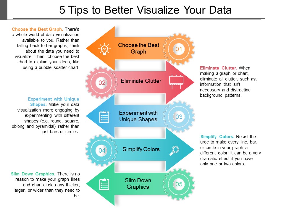
Dramatic and effective data visualization is an art and science that has a set of rules like the five rules shown above. If you would like to learn more on these rules, I would suggest you read “Effective Data Visualization” by Stephanie Evergreen. If you do, it will make your savings job easier by visually displaying the right graphs and charts when you are making savings proposals to your department heads and managers.
1 See video at www.SVAHSolutions.com explaining Clinical Supply Utilization Management in detail.
2 Source: 99designs.com Design Tips for Better Data Visualization.